Throughout the spring semester we have done various workshopping with data sets and data cleaning. Through this we have been able to work with a diverse pool of data sets and analyses. We have done archival methods, surveys, interviews, focus groups, ethnographies, spatial and content analyses, and arguing with data. And now coming to the end of this semester is time for us to piece everything we have learned together.
In the realm of medical care and diseases within the Saint Louis region is really important. Saint Louis Missouri has lots of different tax brackets and people inside of it. Through this final lab each student got a chance to pick out a data set that stuck out to you personally. With being a nursing major the realm of medical concerns and diseases infatuates me. Through this data visualization and analysis, I am in hope that I can see how this data might help us at the Missouri Botanical Garden and our research there.
The importance of this analysis lies in its potential to learn from it and see how this data can compare to the work we are doing with our partners at MOBOT (Missouri Botanical Gardens). By scrutinizing patterns, trends, and correlations within the data, I aim to learn from the data and hopefully learn more about the Saint Louis region. Overall, data visualization serves as a valuable tool in addressing systematic problems by enhancing understanding, facilitating decision-making, and driving positive change across various domains. By having these visual storytelling, organizations and individuals can unlock insights many within complex datasets and work towards more effective solutions.
~The actual Data set~
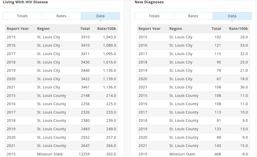
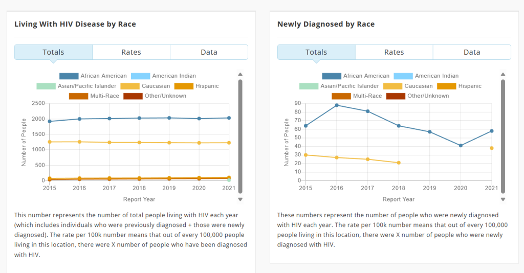
the data set I chose to look closer at.


These data sets above are found from the Saint Louis Gov-MO website. I picked this data set because it reminds me allot of my major and ties it into something that I find very interesting.
This data set above has many different visualizations that you can look through and get a good sense on what you are looking at, this data set is more directly for doctors, medical professionals, or students like me that are looking deeper into data sets. Though this is a really good data set and a very good representation of different people diagnosed with HIV in the Saint Louis region. One thing we can think about is the fact that some people in the Saint Louis region do not have the resources or funds to get tested for HIV, so, I am sure there are a big population of people who do not have accesses to hospitals or even healthcare for that matter. Unlike the people who were able to participate in this study, had access and fundings in order to do this. So, with this information we can see how this data set is kind of bias and maybe not even on purpose, but it is. To avoid bias is a very challenging thing especially working with the super diverse community of Saint Louis.
~Our data set~
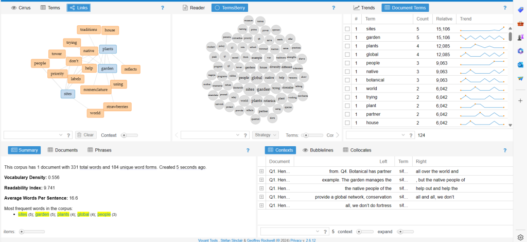
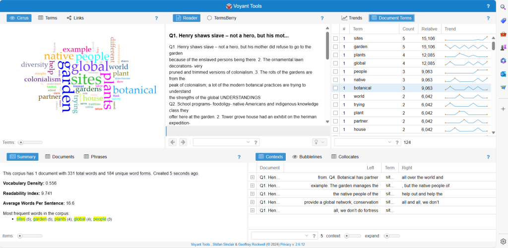
The data set me, and my team worked on.


To get to these data visualizations I used Voyant tools that my professor, Dr. Hildebrandt recommended would be a good tool of turning our data into visuals. Before I got to the visualizations, it was a transcript from some of our focus groups we conducted. Now that I have seen this data visualization compared to my own, I can compare and contrast between the two. Looking at the different data sets ca help me get a different perspective.
- A little overview of our data.
So, in our recent tactics, our focus has been keenly directed towards the meticulous realms of data analysis and data refinement. This phase entailed a comprehensive set of data procured from various surveys and focus groups, followed by an intricate process of scrutiny and interpretation. Our aim was not merely to compile information but to look deeper into the narrative within the datasets to hopefully steer our future actions regarding the development of the untold history and extractive processes at the gardens.
~The Data Set Evaluation~
Analysis
Throughout the spring semester we have had many opportunities to look at different data sets and methodologies. Through looking through the data set provided by the Saint Louis Gov-MO website, we can use it to better understand our data that we have collected. Considering the creators goal for this project was to end HIV epidemic in the Saint Louis region. we can see how that might pre shape the data set, maybe not even intentionally. I also noticed that there are some bias in the data set as well. For who has access to the tests that they ran on individuals and funding as well. “The purpose of this, study is to increase transparency and accountability regarding the state of HIV sexual health and wellbeing for our communities.”- from Fast-Track Cities St. Louis HIV Data. If I were in charge of this, I think I would make the actual testing for the data more accessible to everyone in the Saint Louis region, to try and cut out some of the bias that is on that. In no way HIV an easy thing to get rid of and I would describe it as a wicked problem myself. At the Missouri Botanical Gardens, we have a wicked problem ourselves. Similar to each other, we want to help the better of our communities. This data set helps us look at the bigger picture of our goal at the Gardens. By analyzing and integrating these different types of data, researchers, policymakers, and community leaders can gain a more comprehensive understanding of the complex dynamics of MOBOT and the surrounding Saint Louis region. This understanding can inform evidence-based decision-making and strategies for addressing the needs and aspirations of the community.